UI Designer - UX Researcher
Dr
Revamping homepage to boost sales and conversions, while enhancing usability.
Overview
DrHempMe is an e-commerce website that offers a diverse selection of
CBD products that cater to different needs and preferences of its
customers and their use cases.
The main focus of this redesign is to improve the performance of the
website in terms of conversion rate and sales. By conducting a
thorough analysis of the website's current state, identifying areas
of improvement and implementing strategic changes, the goal is to
increase the number of visitors to the website who actually complete
a purchase.
My Role
Duration
(45 days to audit and UX research + 45 days of UI design)
Results
I totally get it - sharing my results right off the bat might raise some eyebrows, but at the end of the day, businesses are all about the bottom line, right? So why not just put the juicy stuff front and center? It's what businesses really care about after all!!!
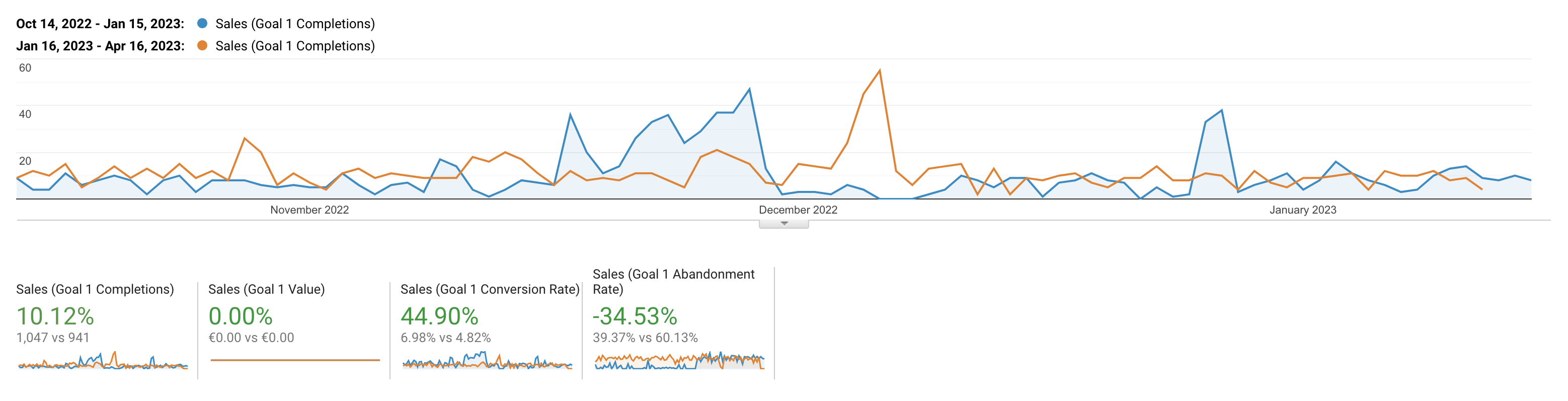
In just three short months after the redesign, here are the (seriously impressive) results this business experienced:
Now that you've seen the impact of good UX practices on sales, let's dig into how I arrived at these winning conclusions and made data-based decisions to boost conversion and enhance usability.

Problem Statement
1. High bounce rate
The website experiences a high bounce rate, indicating that many visitors leave without engaging or converting. This suggests a need to improve the website's design, content, and navigation to retain visitors and guide them towards desired actions.
These aren’t actual conversions, just users who make it to the demo booking page or the resource gate. Gathered, these CTAs lead to only 21 clicks from 1,873 page views. This leaves major room for improvement in this area.
A high bounce rate combined with a high average session duration could mean that visitors are spending a lot of time on the site, but not engaging with the content or completing any desired actions (converting on a sale). This could indicate that the website is providing valuable information, but not effectively guiding visitors towards the desired conversion.
2. Little visitor retention
While returning visitors show higher engagement and conversion rates, they make up only a small percentage of overall traffic. The goal is to convert more new visitors into returning visitors by offering incentives, personalized content, and utilizing email marketing to stay in touch with visitors.
3. Who's our crowd? (target audience misalignment)
he majority of website visitors fall within the 25-44 age range and slightly skew male, which seems to be a different crowd than we want. Reevaluating marketing strategies is necessary to better reach the desired market segment.
4. Homepage as both landing and exit page
Good & bad news. The homepage is the most popular landing, indicating a strong online presence. However, it is also the most popular exit page. There may be a lack of clear CTAs and compelling content, leading visitors to exit without exploring further.
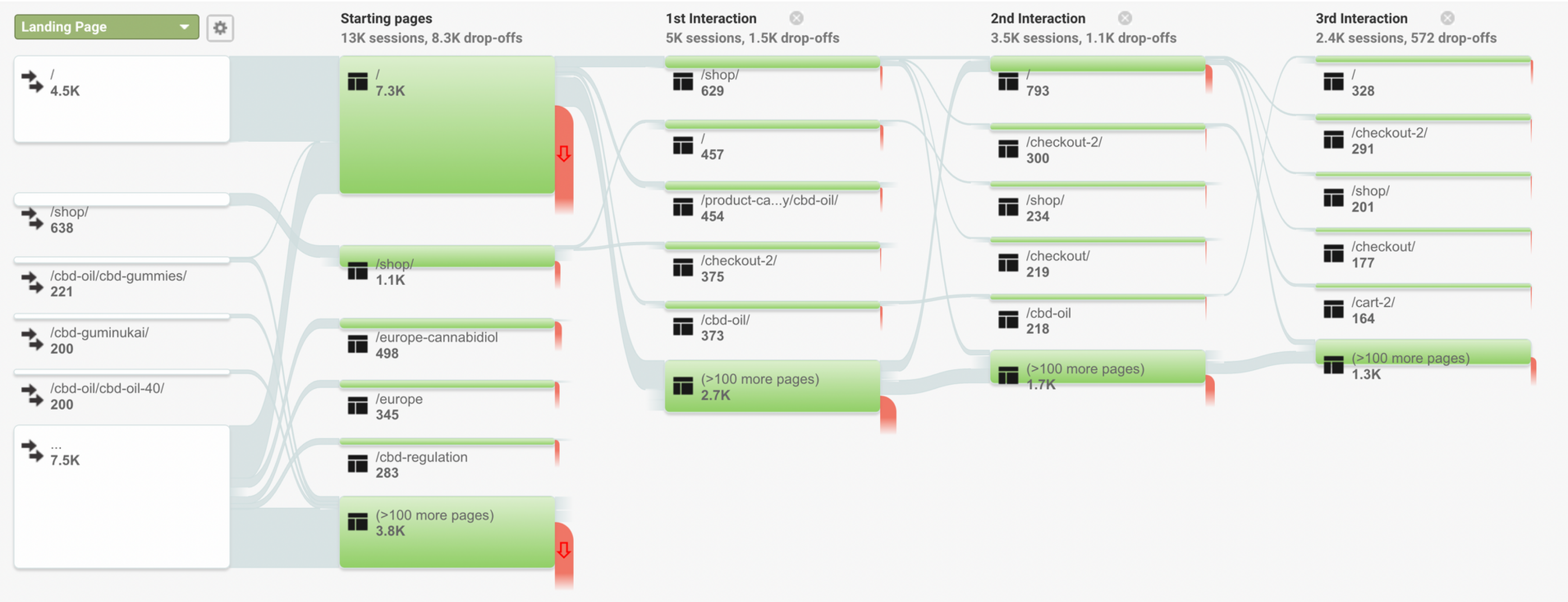
5. Checkout page behavior
The behavior flow analysis shows that users are immediately redirected to the checkout page after adding products to their carts. While this can increase conversions, it may also cause some users to leave without completing a purchase. I suggest giving users the option to continue shopping so they can take their time and feel more in control.
Competitive Analysis
The competitive analysis was conducted by identifying two direct competitors in the CBD market. Data was gathered by exploring competitors' websites and analyzing their target audience, conversion strategies, user engagement elements, and customer support features. Here's a summary of the key findings:
1. fabcbd.com
The website showcases a clean and professional design with
effective social proof through user testimonials and magazine
logos. They use high-quality product mockups and photos of real
individuals using their products, enhancing authenticity.
The website employs persuasive language to highlight customer
benefits and offers intuitive navigation with an advanced mega
menu. Helpful features like well-organized FAQs, product
recommendations, and a cost calculator for free shipping enhance
the user experience.
2. fivecbd.com
The website impresses with a fun and colorful design, offering
simple navigation and a personalized experience through an
interactive quiz. Transparent information about product details
and ratings builds trust, while grouping products based on use
cases adds convenience. They also showcase authentic images of
people using their products.
However, the website lacks sufficient social proof and real people
images on the homepage, and the use of low-quality illustrations
could be improved for larger screens.
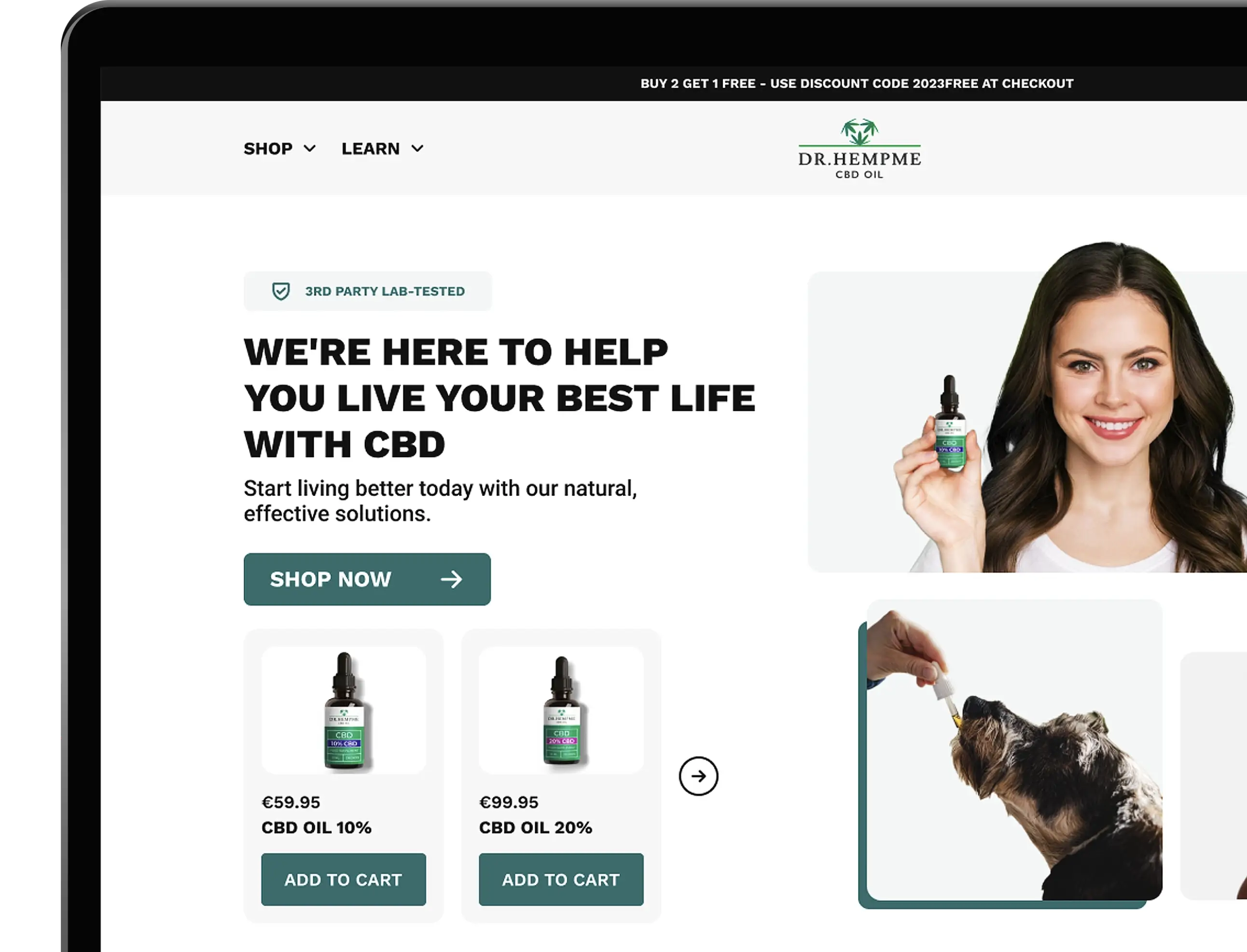
Wireframing
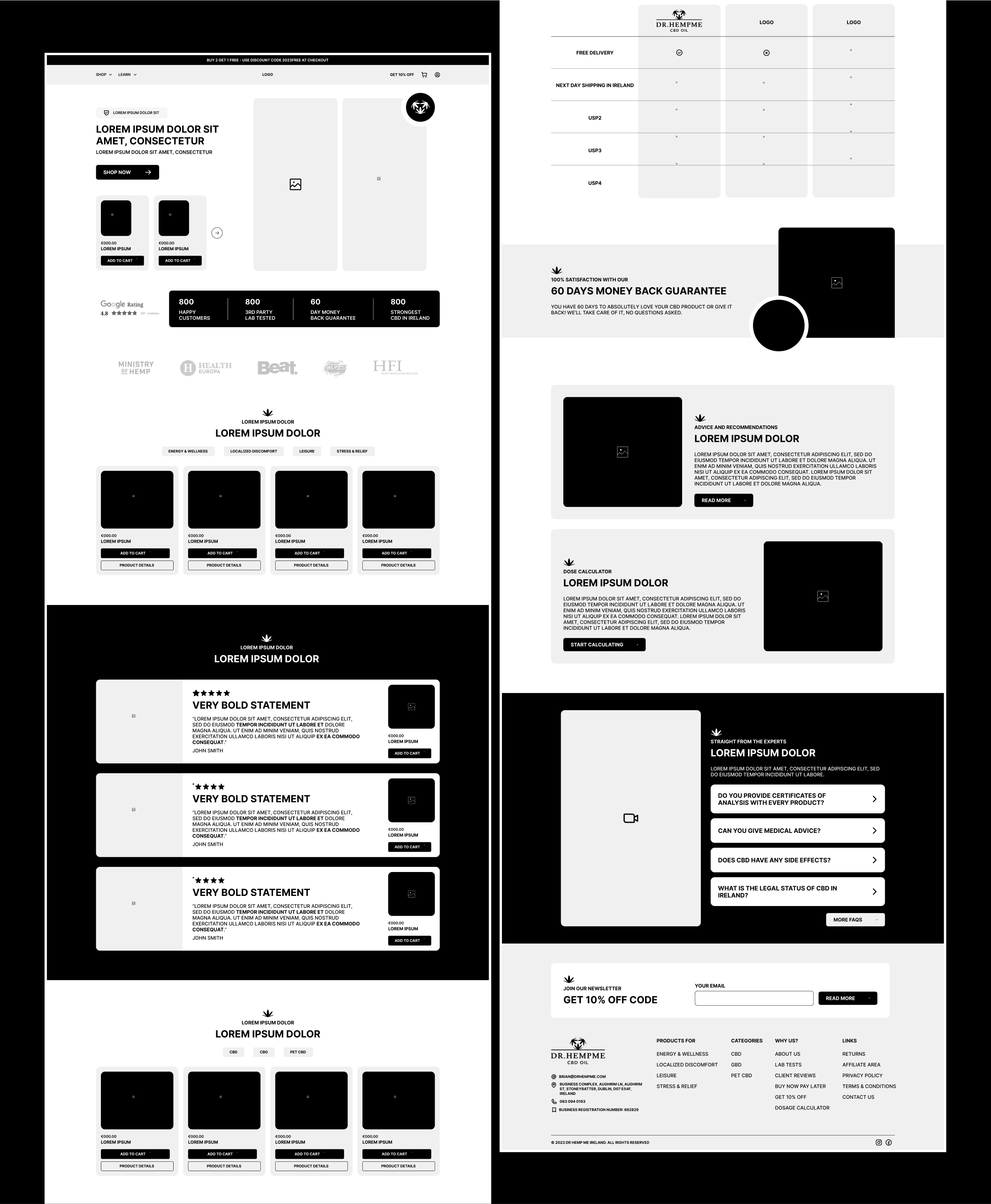
Landing Page Redesign
The main challenge in designing this website was the restriction on
using certain words like "Sleep," "Medication," and "Anxiety," which
are crucial in addressing client pain points and making them feel
seen.
I had to get creative and think of ways to tackle client problems
without resorting to those prohibited phrases. Luckily, the business
had received plenty of glowing reviews from happy customers. I
thought, why not let those satisfied clients do the talking for us?
If they mentioned those specific phrases in their testimonials, it
wouldn't pose any legal issues since it's just a direct quote from
them. It turned out to be a great workaround for this situation, and
it felt like a win-win. The business could showcase its
effectiveness and make customers feel seen, all while staying within
the legal boundaries.
I strategically placed these testimonials in prominent spots to
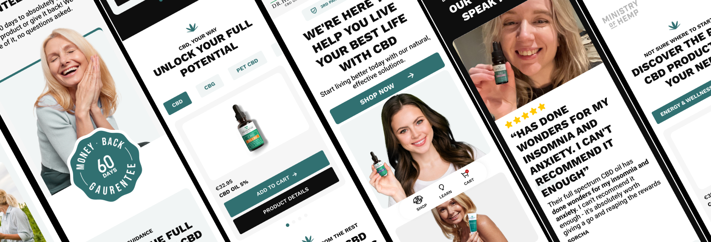
catch the visitors' attention right away. By showcasing real stories
of satisfied customers and the benefits they experienced aside their
real image with the product they’ve used, I was able to create a
strong sense of trust and credibility for the products.
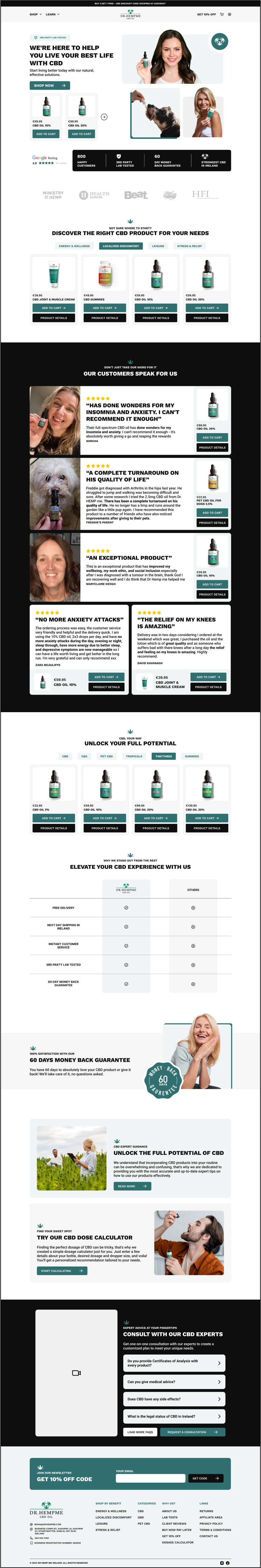
I used a conversational tone in the copy to make users feel
comfortable and at ease while browsing. No walls of text here! I
kept it concise and easy to read, especially on mobile devices.
I added transitional CTAs throughout the website to guide users to
relevant information without overwhelming them. I also used VideoAsk
to add a personal touch and build a connection with potential
customers. People love to see real faces, right?
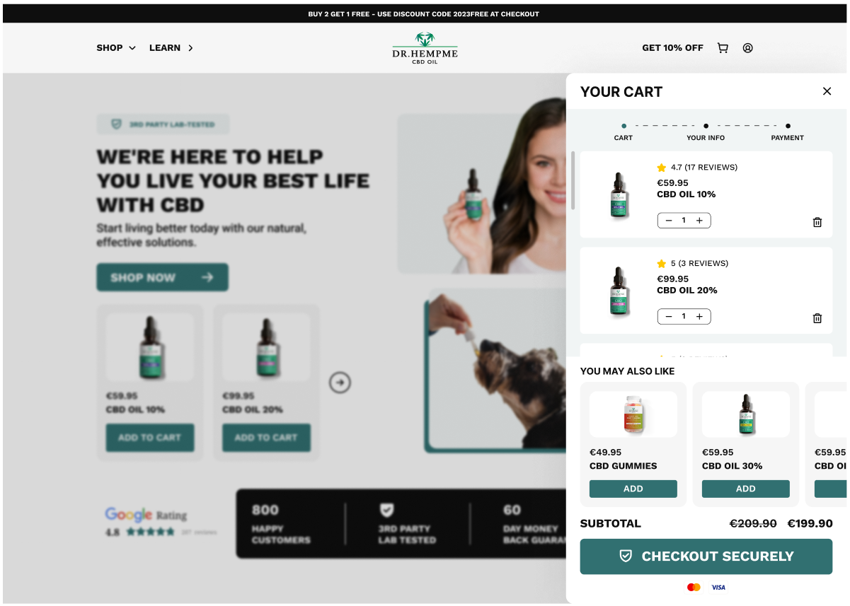
Checkout Process Redesign
Before implementing the dynamic sidebar checkout cart, the
website's checkout process had a critical flaw. Whenever users
clicked on the “Add to Cart” CTA, they were immediately taken to
the checkout page without the opportunity to review their cart or
make any adjustments. some users might have been caught off guard
or felt rushed, leading to cart abandonment.
By implementing this dynamic cart, users had more control over
their shopping experience, and they could easily continue
exploring other products without losing track of what they
intended to purchase.
This improvement reduced friction in the checkout process, making
it more user-friendly and reduces the likelihood of cart
abandonment from 60% to 39%!
I added a progress bar, so customers could see exactly where they
were in the checkout journey.
The text on the "Place Order" CTA button was tweaked to something
more explicit, "Proceed to Payment." This made it clearer for
customers what the next step in the process would be, reducing
uncertainty.
To present upselling opportunities, the cart was also utilized to
show related products that customers might be interested in based
on popular or frequently bought-together items.
And since so many people shop on their phones, I made sure the
whole process was mobile-friendly.
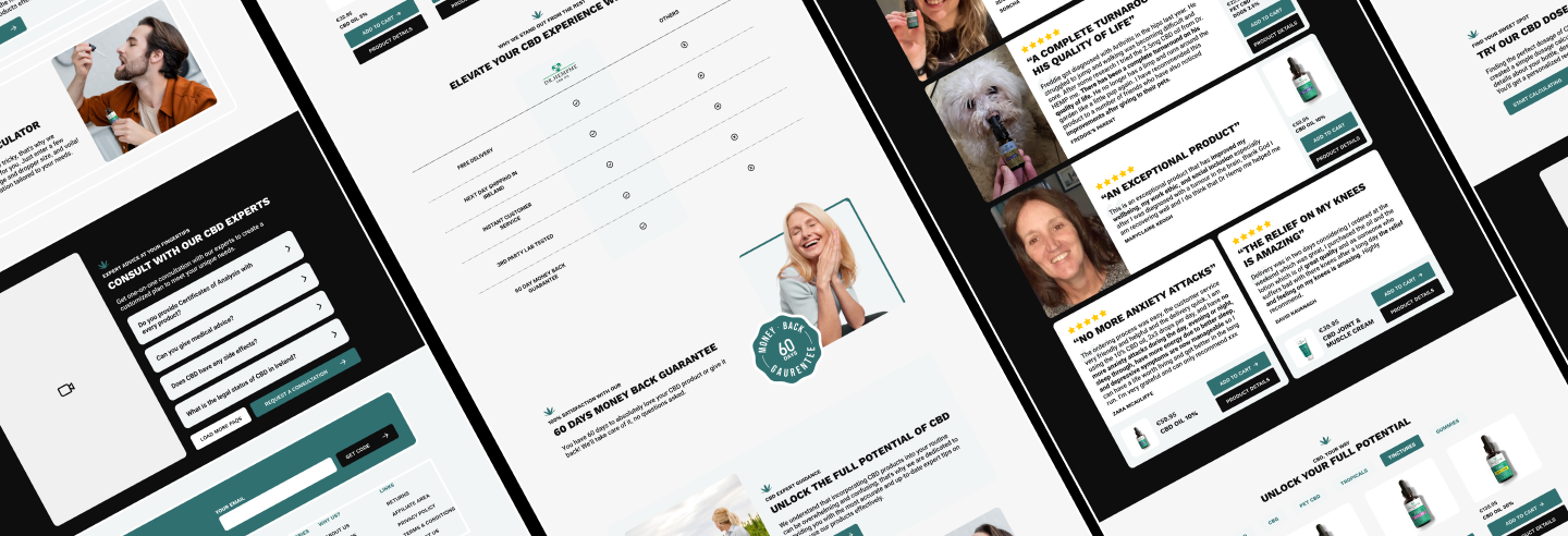
Menu Redesign
Before the improvements, the menu lacked organization and
simplicity, making it challenging for users to navigate the
website efficiently.
To enhance the menu, a mega menu was implemented for the "Shop"
label, grouping products by category and making it easier for
users to browse and find what they needed.
Two simple and straightforward menus, "Why Fab?" and "Learn," were
also introduced, providing easy access to essential information
about the company and its products.
These changes streamlined the navigation experience and ensured
users could access important pages with just a few clicks.
Mobile Experience Redesign
Previously, the mobile user experience was subpar, with issues such
as text overlap and difficulty reading content due to poor contrast.
Text overlap was resolved, ensuring that all content displayed
correctly on mobile devices. Addressing contrast issues made the
text and elements easily readable for users with visual impairments.
The dynamic sidebar checkout cart was introduced, making it more
mobile-friendly and allowing users to view and manage their cart
without leaving the page they were on.
The size of interactive elements, such as buttons, was increased to
accommodate touch interactions. This prevented users from
accidentally clicking on the wrong item and improved overall
navigation efficiency.
Personal Learnings
• Dealing with those legal restrictions on certain words was tough,
but it pushed me to think outside the box. Finding alternative ways
to address client pain points while staying compliant was a real
challenge that I embraced.
• Letting real clients talk about their experiences built trust and
made the website so much more credible.
UI Designer - UX Researcher
RAK
UX Researcher
One
