RAK
Rethinking and perfecting the information consent and opt-in confirmation mobile experience.

Overview
The consent process involves obtaining users' explicit permission
to collect and utilize their personal and financial data, as well
as enabling them to customize their preferences for various
banking services and features.
100% of users will be required to complete this form in order to
gain access to the mobile app.
My Role
Duration
Challenge
How might we create an opt-in process to create a seamless and user-friendly experience within the mobile application?
Problem Statement
The challenge lies in designing a consent process that meets the requirements of the app while ensuring a seamless and secure user experience. It was also challenging to strike a balance between legal compliance and user-centricity.
1. Inability to modify consent choices
The first issue is the lack of flexibility for users to revisit and change their consent choices. It was found that there was no clear mechanism to revisit and modify consent choices on the spot, which may lead to users experiencing a sense of being locked into their initial decisions.
“I made a mistake with my consent choices, but found that there's no way to correct it. I felt stuck with my initial decision.”
2. Unclear confirmation process
Users need a clear and easily accessible button or interaction that confirms their choices. If the confirmation process is ambiguous or hidden within the interface.
“The consent process is a bit confusing. I thought I confirmed my choices, but then I realized I missed the confirmation button.”
3. No clear important information display
Users feel like they require additional context, explanations, or details about the implications of their consent choices to be able to correctly answer the questions.
Empathy Map

Pain Points
- Lack of clarity and understanding in the consent process.
- Difficulty in modifying consent choices later on.
- Lengthy and confusing consent forms.
- Fear of data misuse or privacy breaches.
- Uncertainty about the legal implications of consent choices.
Needs
- Clear and concise explanations of the consent process and its implications.
- Transparency in how data is collected, used, and shared within the app.
- Control and customization options to align with personal preferences.
- Assurance that the app and bank are compliant with privacy regulations.
- Easy and accessible ways to review and modify consent choices.
- Confidence that the app respects and safeguards user data.
Discovery
We unearthed useful insights through analyzing usage data and engaging in user research. Here are the key findings:
- A majority of 61% of users opt for using the mobile app instead of the web dashboard to access their banking info.
- The heat map revealed that users did not interact with the important information section. As a result, they were unaware of the legal details they were getting themselves into.
- Based on user interviews, it was found that 2 out of 5 (40%) of the users encountered difficulty in accessing the confirmation button.
- During the user research sessions, it was observed that some participants exhibited a natural inclination to close any pop ups. As a result, they inadvertently closed the consent form and became confused about the subsequent steps they needed to take in their journey. It was like a major "Uh-oh, now what?" moment for them.
Ideation & Implementation of UX Suggestions
It was vital to me to ensure that all user problems were solved
suring this phase. I made sure to offer users the ability to
revisit and change their consent choices at any time using a
simple back button. I understand that users have the opportunity
to modify their preferences at any time through settings, but it
is likely that they are too lazy to do so. It’s simply frustrating
not being able to change previous choices on the spot.
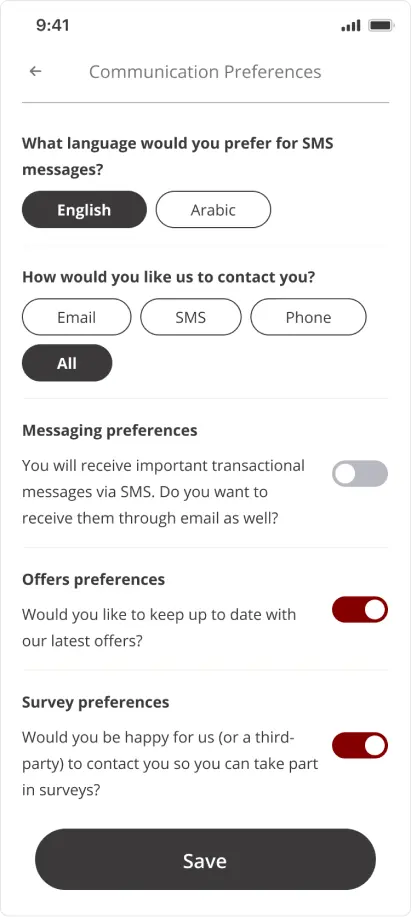
To confirm the user's choices, I used a clear and
easily accessible switch element for yes/no questions. This should
help condense the appearance of the questions, making them look
less intimidating. It should prompt users to finish the form
quicker because they perceive the form as smaller.
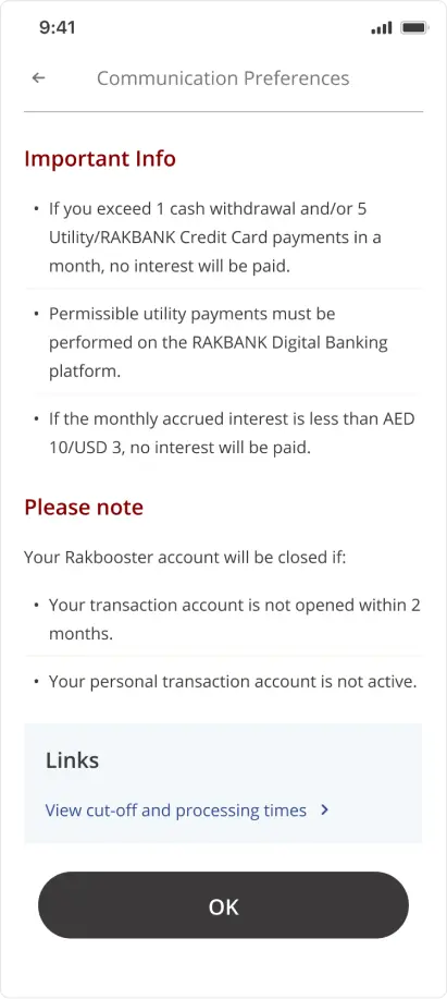
To address the issue with the ambiguity of the legal information,
as a part of the journey itself, I showed important information in
a seprate page rather than having it hidden under the CTA.
Polish
After a little bit of back and fourth with the PM and legal team, I polished the agreed upon wireframes.
Results and Personal Learnings
UX Results
- In follow-up interviews, users had improved comprehension of what exactly they were consenting to.
- Users expressed positive feedback towards the new switch method, resulting in increased interaction and engagement with the consent screens.
- 100% of users are now able to easily identify and locate the confirmation CTA without any difficulties.
Personal Learnings
- This was the first time I got to work alongside a legal team. Although it was challenging keeping up with their requests and modifications, I appreciate the opportunity to interpret their inputs from a UX standpoint and properly integrate them into the mobile app.
UI Designer - UX Researcher
Dr
UX Researcher
One Pulse
