UX Researcher
One Pulse
Identifying issues, potential opportunities and analyzing data to boost CRO & UX.

Overview
One Pulse offers an insights platform that helps businesses and
brands easily conduct market research and easily find comprehensive
answers that empower them to make evidence-based decisions in less
time.
The website serves as a sales tool to attract new customers to test
out their platform, with some options to allow users to convert into
paying customers.
The business’s ultimate goal is to capture qualified brands and
increase lead signups and demo requests.
My Role
Duration
Challenge
How might we correctly evaluate current user experience to identify areas of improvement and provide data-based suggestions to raise conversions and sales?
Problem Statement
The website's current UX weaknesses and technical deficiencies are impacting user engagement, lead conversion, and brand perception. Here are the key problems detected:
1. Inaccurate user targeting
The website isn’t clear on the target audience. The goal should be to get into users' heads and really understand what they're struggling with. This will eventually help them self-identify as target audience. Tailoring the website to meet users’ pain points and meet their specific needs should make it more appealing.
2. Inconsistent traffic
According to Google Analytics, traffic has inclined over the past 3 months. The traffic curve seems to be inconsistent in terms of growth. It shows constant falls and climbs with no specific trends or behavior patterns. After eliminating bot traffic, a spike in traffic was detected on May 17th, 12th and June 9th due to linkedin driven traffic.

3. Poor conversion rates and ineffective CTAs
The current CTA strategy is not effectively converting users into leads and customers. Despite high traffic, CTAs at the bottom of resource pages are failing to generate significant conversions, indicating a need for a more impactful and compelling CTA approach.
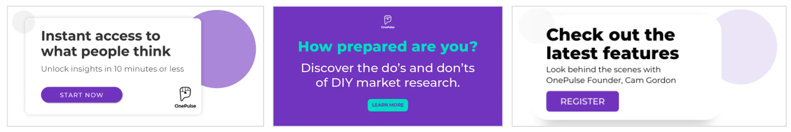
These aren’t actual conversions, just users who make it to the demo booking page or the resource gate. Gathered, these CTAs lead to only 21 clicks from 1,873 page views. This leaves major room for improvement in this area.
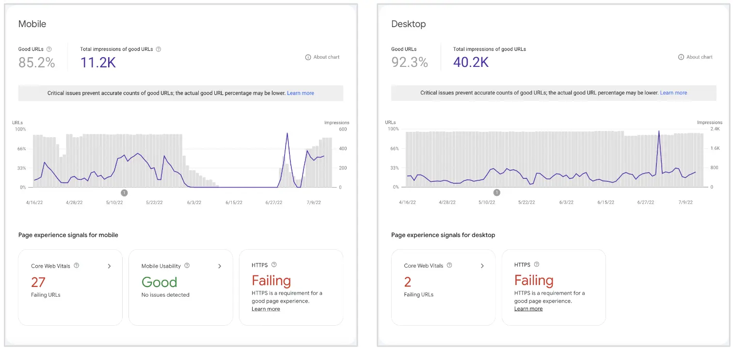
4. Usability and security issues
The website's Lighthouse performance scorecard highlights subpar
technical performance, including low scores in accessibility and
SEO. These issues contribute to slow loading times and detract from
the overall user experience, potentially impacting search engine
rankings and traffic.
Some usability issues were
detected through Google's Core Web Vitals standards and HTTPS
security. These also seem to be compromising the user experience and
search engine rankings.
KPIs
The following success indicators will be used to evaluate the effectiveness of the audit:
- Targeting specific user personas, their pain points, and providing them with enough helpful information to lead change within their organization.
- Identifying and fixing all weak points of the user journey by closely guiding potential customers and pushing them to convert.
- Enhancing marketing tactics to shift brand perception into a digital solution rather than a survey provider.
- Helping users understand the product, it’s features and how to best leverage them for maximum results for themselves and/or their clients.
- Design the website to keep users engaged and interested, resulting in longer average session durations and deeper interactions.
- Craft compelling and clear CTAs that guide users to take desired actions.
Competitive Analysis
The competitive analysis was conducted by identifying five direct and indirect competitors in the insights platform market. Data was gathered by exploring competitors' websites and analyzing their target audience, conversion strategies, user engagement elements, and customer support features. Here's a summary of the key findings:
- Four out of five competitors prominently display client testimonials on their websites. This strategy is used to build trust and credibility by showcasing positive feedback and experiences from satisfied customers.
- All competitors use live chat features to engage with users in real-time, answer their questions, and guide them through the sales funnel. This interactive approach can lead to better user support and improved conversion rates.
- Surprisingly, none of the competitors utilize product demonstration videos on their websites. Incorporating videos can be an opportunity for One Pulse to stand out and effectively showcase the platform's features and functionalities.
- All competitors use high-quality product mockups to introduce and highlight their platform's features. These visually appealing representations help users understand the platform's capabilities more effectively.
- Four out of five competitors feature pictures of real people on their websites, likely to create a sense of authenticity and human connection with the audience.
- The majority of competitors use gated resources such as white-papers, case studies, or eBooks to capture user information. This strategy helps in lead generation and building a database of potential customers.
Review of core templates
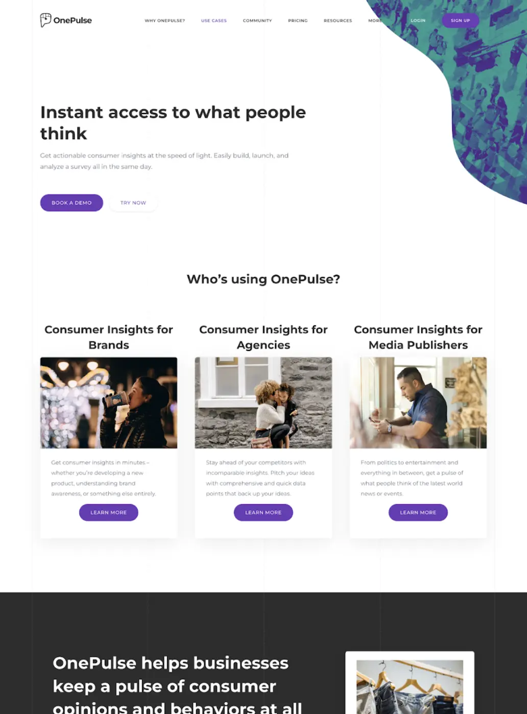
Current "Home" template
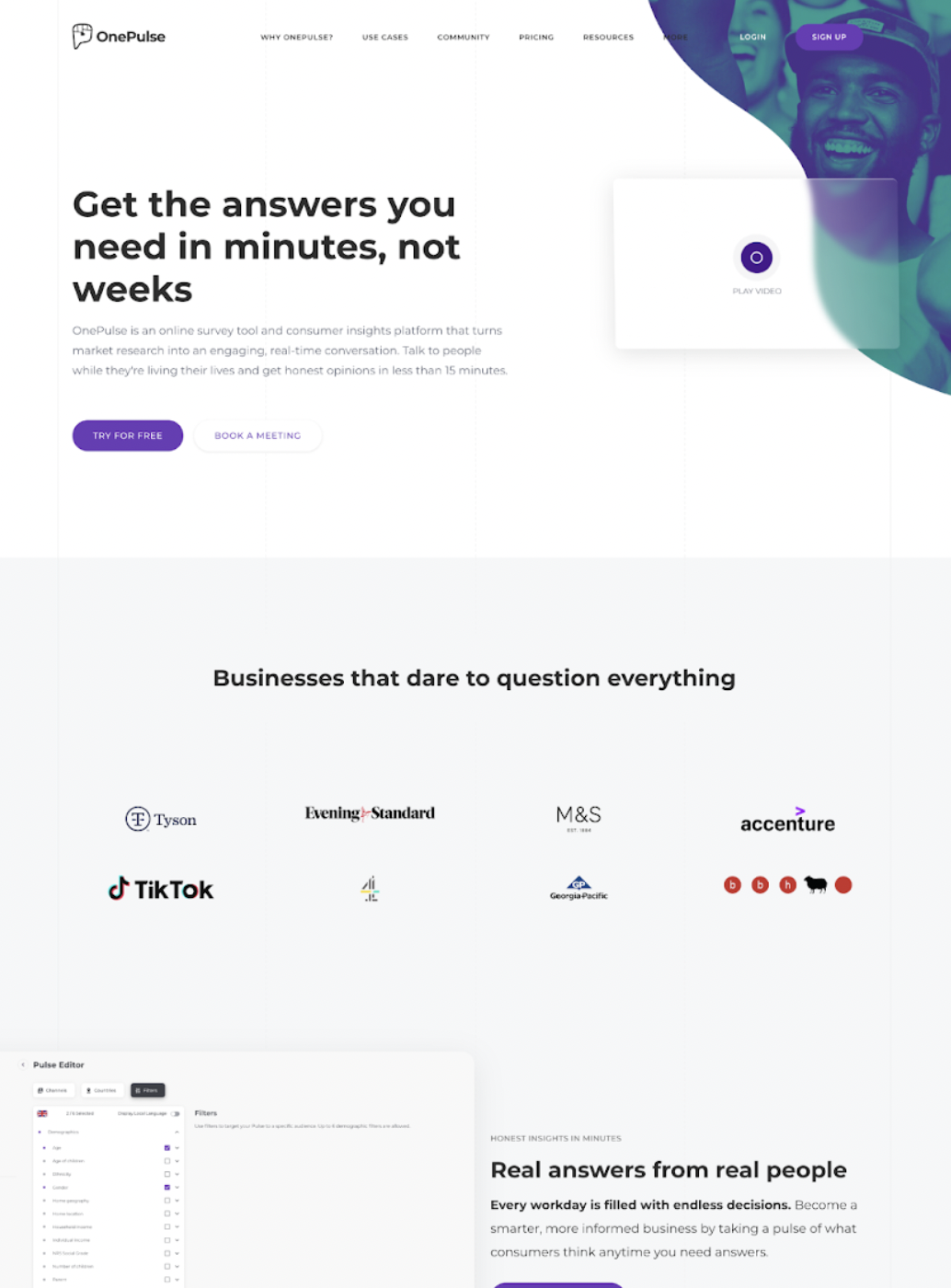
The website's homepage did a pretty good job of introducing how the
product works and convincing prospects to buy it, but there's always
room for improvement.
The images on the website, especially the ones on the homepage, they
should have a clear purpose and function. Users nowadays expect
sharp, clear images that look great. Poor quality screenshots can
really impact the user experience and how they perceive the
product.
To really connect with the audience and leave a lasting impression,
try including different feature snippets that explain how the
product can be used in various scenarios and how it can benefit
different businesses. Adding that personal touch can make a big
difference!
Current "Product Feature" template
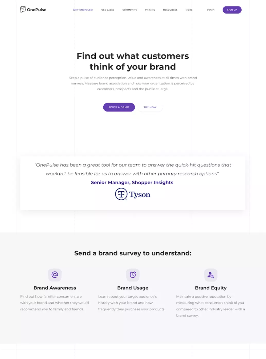
A product’s sales page can make or break a conversion. This is a
chance to convince visitors to consider the product and hopefully,
convert.
A user is on this page if they want to see more of the product and
understand how it works. This is where you want to use the most
social proof. Instead of sourceless quotes, use tailored client
testimonials displaying a company logo and a real photo of clients
to increase trust and credibility (ideally tied to a case study).
After listing a set of features, you may want to use a transitional
CTA that promotes the free trial. I also recommend adding shorter
snippets where you simply explain how the product works in 3
straightforward steps, as well as how to get started with one
pulse.
Use storytelling to assist visitors in making their purchase
decision by helping them put themselves in a client’s shoes and view
the product from their perspective. Use visuals and simple copy to
create a narrative that makes a connection between thr product and
why should prospects use it. Understand why a certain organization
needs your product and target that pain point to appeal to their
needs.
I recommend including more images of real people, with more
information about how your customers are using the product, and the
benefits they’re experiencing from it.
Current "Use Cases" template
The blog page should be aimed at providing the users at the top of
the funnel with the most important information covering any and all
areas of the service.
As it stands, the blog template does a good job of providing enough
educational information that guides visitors from the top to the
bottom of the funnel.
This is where prospects would go to see how the product works for
their specific use case. The purpose of this page is to connect with
the target audience and help them make a decision.
There’s nothing as powerful as actually speaking to your audience.
Start by illustrating your prospects’ problems to convey how well
you understand their pain points and end by describing how your
service meets their needs. Because most people would rather explore
media than read text, remember to extensively use high quality
mockups and videos of your product.
Final UX Suggestions
Based on the insights from the data analysis, competitive analysis and the current state of the website pages, these are the final UX suggestions to enhance the overall user experience and boost conversion (It should be noted that the client was originally presented with 20+ suggestions):
1. Restructure content to reduce information density and create engaging experiences
Remember to always disclose only necessary information. For example, if a user works in brand tracking, they do not need to be distracted by the other use case categories. One way to solve this problem is to use interactive tabs to reveal only the essentials. A user can then choose to proceed to dive deeper and learn more about their case of choice.
2. Use visual storytelling to create an immersive user experience
Telling a story rather than simply listing facts is a great way to infuse empathy and create a positive user experience. It doesn’t have to be complex. Use simple words and one-liner content. Make your visitor the main character and narrate the events that they experience before, during and after using your product.
3. Only use high-resolution screenshots and mockups
Human beings are highly visual creatures who are able to process visual information almost instantly. 90% of all information that we perceive and that gets transmitted to our brains is visual. Image quality can truly make or break your user experience and interface. Especially when it comes to introducing your product. Nowadays, high-quality media is a must-have, not an option.
4. Create video case studies to guide users within the evaluation stage of the funnel
You already know the value of social proof and how people are more likely to invest in a service that is highly rated - as opposed to one without any social proof. Prospects want to watch other clients with similar backgrounds and pain points discussing their experience with your service. This can be one of the most powerful tools on your belt if you put time and effort into your case studies.
5. Talk about prospects’ problems and how you solve them
Users must be able to easily determine whether your product meets their needs and why they should do business with you. Show them you are able to empathize with them by listing their problems and how you are able to solve them.
6. Sell users on outcomes not services
You don’t want to sell the shovel, you want to sell the hole the shovel makes. Put the user’s goals at the forefront of your UX strategy by presenting them with the outcomes they want to achieve. Your job is to connect the dots between what they want and how you can get them there in the most efficient way possible.
7. Create targeted experience so different personas can learn about how they can best utilize your service
Every customer’s expertise with tech is different, so their related problems too. Ask them about their struggles with the product’s understanding and offer them a personalized solution.
8. Create bite-sized tips and tricks videos to target top-of-funnel leads
Analyze your audience and create short content offering them the best tips and tricks that help them solve real problems and get where they want in the shortest time frame possible. Your customers are interested in the final results they can instantly achieve.
9. Use more genuine images of people to create a deeper emotional connection
Images are crucial whether it is to convey a message, tell a story, or evoke an emotion. Seeing smiling people triggers an automatic response in humans that release pleasurable chemicals in our brain, like dopamine and serotonin. Adding photos of actual people SMILING and enjoying their experience is a literal hack to making people trust you more.
10. Tell users exactly what they can expect from contacting you
Our brains find comfort in familiarity. Tell people what to expect out of your call with them. Before getting on a call with you, your prospects need you to tell them about their problem and how you can help them to fix it. Present your process in detail. It may help both parties if you divide the experience into steps. Use pictures and short sentences to familiarize people with the idea of speaking with you.
UI Designer - UX Researcher
RAK
UI Designer - UX Researcher
Dr
